Thursday, July 23, 2015

Resource Dictionary, App.config

Resource Dictionary
In a ResouceDictionary, we can keep our custom styles, DataTemplates, ControlTemplates, even custom definitions for Brush, Color, Background and a lot of other stuff. But, the important thing is that we have to assign a key to each of them since it is a Dictionary. Or perhaps, we can give names to the styles.

Using Resource Files in XAML

In this section, we are going to see how we can import a resource file to a XAML file for a user control or a Window or a page. Below is provided a simple code listing for demonstration. Since we can have a resource dictionary for each control, we are going to merge the other resource files to the existing resource dictionary.

<Window x:Class="WPFDemo.Window1"
   xmlns="http://schemas.microsoft.com/winfx/2006/xaml/presentation"
   xmlns:x="http://schemas.microsoft.com/winfx/2006/xaml"
   Title="Window1" Height="300" Width="300">
   <Window.Resources>
       <ResourceDictionary>
           <ResourceDictionary.MergedDictionaries>
               <ResourceDictionary
                 Source="Resources/MyResourceDictionary.xaml">
               </ResourceDictionary>
               <ResourceDictionary
                 Source="Resources/OthersStyle.xaml">
               </ResourceDictionary>
           </ResourceDictionary.MergedDictionaries>
       </ResourceDictionary>
   </Window.Resources>
   <Grid>
       <Image Source="/WPFDemo;component/Images/AddResourceDictionary.jpg"></Image>
   </Grid>
</Window>

Using Resource Files in C#

There can be cases where we need to access a resource dictionary that we have defined in our project, from C# code. If we have already merged our resource dictionary in XAML, it is easy to access the inner resources using the control.FindResource("KeyWillGoHere"); method. But ,if we haven’t merged the resources in XAML and we still need to use the resource dictionary, we have options to use the stuff directly in C# code. Here is a simple code snippet given for better understanding:
Collapse | Copy Code
public partial class Window1 : Window
{
   private ResourceDictionary myresourcedictionary;
   private ResourceDictionary mystyles;

   public Window1()
   {
       InitializeComponent();
       
       myresourcedictionary = new ResourceDictionary();

       myresourcedictionary.Source =
           new Uri("/WPFDemo;component/Resources/MyResourceDictionary.xaml",
               UriKind.RelativeOrAbsolute);

       mystyles = new ResourceDictionary();

       mystyles.Source = new Uri("/WPFDemo;component/Resources/OthersStyle.xaml",
               UriKind.RelativeOrAbsolute);

   }

   public void ApplyStyle()
   {
       Style mybuttonstyle = mystyles["MyStyle"] as Style;
       Button mybutton = new Button();
       mybutton.Style = mybuttonstyle;
   }
}

App.config
App.xaml is the declarative portion of your code (usually generated by Visual Studio) extendingSystem.Windows.Application. For example, Expression Blend can use App.xaml to share a Resource Dictionary or a design-time data set with your entire application. And, because we are using Microsoft products, whatever Expression Blend can do auto-magically, we can do by hand in Visual Studio. The major purpose for App.xaml is for holding resources (style, pens, brushes, etc.) that would like to be available through out all of the windows in your application.

Mode in WPF

Mode in WPF
You use the Mode property to specify the direction of the binding. The following enumeration list shows the available options for binding updates:
  • TwoWay updates the target property or the property whenever either the target property or the source property changes.
  • OneWay updates the target property only when the source property changes.
  • OneTime updates the target property only when the application starts or when the DataContext undergoes a change.
  • OneWayToSource updates the source property when the target property changes.
  • Default causes the default Mode value of target property to be used.

WPF or Winforms

What is preferable WPF or Winforms?
WPF is just a different type of Windows-based solution when compared to WinForms. Microsoft has not stated anything about WPF replacing WinForms, when, in fact, it is just another tool available to the Windows developer.

WPF :
1. The ability to make very rich UIs relatively easily.
2. Easier animation and special effects
3. Inherent scalability
4. Powerfull styling and skinning structure
5. Easy to create an own Look and Feel
6. Does support Windows Forms
7. The future technology for developing Vista Applications
8. The ability to reuse existing code
9. Highly advanced databinding possible
10. Declarative vs procedural code
11. Requires .NET Framework 3.0
12. Compared to Windows Forms, still in development fase
13. Requires Dx9 compatible vidcard for advanced graphics
However, there are drawbacks to WPF, where WinForms comes out on top:
1. WPF's in-box control suite is far more limited than that of WinForms.
2. There's greater support in the 3rd-party control space for WinForms. (That's changing, but for now by advantage of time, WinForms has greater support in the community.)
3.WPF will not run on windows 2000 or lower.
4. Extensive documentation to be found on the internet FOR WIN Forms
5. Plenty of examples FOR WIN Forms
6. Design your own look and feel in a application is a lot of work.
7.C# is slower to run. This is somewhat taken care of when using WPF, although currently the launching of WPF application is still a bit slow. However, after the program is launched, the animation effects are all very smooth.

Winow, page and user control

A Window object is just what it sounds like: its a new Window for your application. You should use it when you want to pop up an entirely new window. I don't often use more than one Window in WPF because I prefer to put dynamic content in my main Window that changes based on user action.
A Page is a page inside your Window. It is mostly used for web-based systems like an XBAP, where you have a single browser window and different pages can be hosted in that window. It can also be used in Navigation Applications like sellmeadog said.
A UserControl is a reusable user-created control that you can add to your UI the same way you would add any other control. Usually I create a UserControl when I want to build in some custom functionality (for example, a CalendarControl), or when I have a large amount of related XAML code, such as a View when using the MVVM design pattern.

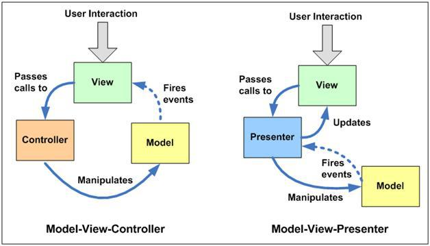
MVC Vs MVP vs MVVM

MVC Vs MVP vs MVVM
MVP
  • Use in situations where binding via a datacontext is not possible.
  • Windows Forms is a perfect example of this.  In order to separate the view from the model, a presenter is needed.  Since the view cannot directly bind to the presenter, information must be passed to it view an interface (IView).
MVVM
  • Use in situations where binding via a datacontext is possible.  Why?  The various IView interfaces for each view are removed which means less code to maintain.
  • Some examples where MVVM is possible include WPF and javascript projects using Knockout.
MVC
  • Use in situations where the connection between the view and the rest of the program is not always available (and you can’t effectively employ MVVM or MVP).
  • This clearly d  Microsoft’s ASP.NET Mescribes the situation where a web API is separated from the data sent to the client browsers.VC is a great tool for managing such situations and provides a very clear MVC framework.

Triggers in WPF

WPF Triggers
Triggers define a list of setters that are executed if the specified condition is fulfilled. WPF knows three diferent types of triggers
  • Property Triggers get active, when a property gets a specified value.
  • Event Triggers get active, when a specified event is fired.
  • Data Triggers get active, when a binding expression reaches a specified value.
<Style x:Key="styleWithTrigger" TargetType="Rectangle">
    <Setter Property="Fill" Value="LightGreen" />
    <Style.Triggers>
       <Trigger Property="IsMouseOver" Value="True">
           <Setter Property="Fill" Value="Red" />
       </Trigger>
    </Style.Triggers>
</Style>
<Rectangle Style="{StaticResource styleWithTrigger}"></Rectangle>

DataTrigger  

<Window.Resources>
<Style TargetType="Button">
   <Style.Triggers>
       <DataTrigger  Binding="{Binding
                     RelativeSource={RelativeSource Self},
                     Path=Content}" Value="Click Me!">
           <DataTrigger.Setters>
               <Setter  Property="FontSize" Value="20" />
           </DataTrigger.Setters>
       </DataTrigger>
   </Style.Triggers>
</Style>
</Window.Resources>
<StackPanel>
   <Button Content="Click Me!"
           Height="40" Width="150" Margin="5" />
</StackPanel>

Event Trigger
<Window.Resources>
<Style TargetType="Button">
<Style.Triggers>
   <EventTrigger RoutedEvent="MouseEnter">
       <EventTrigger.Actions>
           <BeginStoryboard>
               <Storyboard>
                   <DoubleAnimation
                       Duration="0:0:0.5"
                       Storyboard.TargetProperty="Width"
                       To="200"  />
               </Storyboard>
           </BeginStoryboard>
       </EventTrigger.Actions>
   </EventTrigger>
</Style.Triggers>
</Style>
</Window.Resources>
<StackPanel>
<Button Content="Click Me!"
Height="40" Width="150" Margin="5" />
</StackPanel>

MultiTrigger
This is similar to Trigger but combines multiple conditions and all the condition must met to execute setter collection defined in multitrigger.
<Window.Resources>
<Style TargetType="Button">
   <Style.Triggers>
       <MultiTrigger>
           <MultiTrigger.Conditions>
               <Condition Property="IsDefault" Value="True" />
               <Condition Property="IsMouseOver" Value="True" />
           </MultiTrigger.Conditions>
           <MultiTrigger.Setters>
               <Setter Property="FontSize" Value="20" />
               <Setter Property="FontWeight" Value="Bold" />
               <Setter Property="Foreground" Value="Red" />
           </MultiTrigger.Setters>
       </MultiTrigger>
   </Style.Triggers>
</Style>
</Window.Resources>
<StackPanel>
   <Button Content="Click Me!" IsDefault="True"
           Height="40" Width="150" Margin="5" />
</StackPanel>